Into the Void
Brutally minimalist? Or simply a clean place to start?
Into the Void: When is Negative Positive?
Less is always more.
We know this. It’s an irrefutable quality of whatever constitutes enduringly great design. The kind of stuff that ‘works timeless magic’, appears ‘classic’ or simply still looks sensational when you step back into it ten years later.
It works for fashion. Glitzy fads seem gauche after a season, whereas simple denim or that little black number will always do the trick. The same holds for great cuisine. Keep things essential and close to their origins and you’ll distil the very best of them on your taste buds.
Equally, well-considered interiors that stand the test of time tend to resist the temptation to embellish too much, to work with simplified tones as the base stratum, letting flashes of colour play their parts on a background of calm.
But why is this? Why not go all out with a total design riot and enrich our senses to the fullest?
Space…Spacious?
The great excitement of a new house, office, or other interior volume is that it is a tabula rasa, a blank sheet on which to project your design, emotion, and desire. Despite the best of intentions, this can often result in filling that space. It doesn’t matter what with, placing objects in space will diminish its potential.
It could be an oversized bed, placed in the expectation of better sleep after your tiny, cramped first apartment. A row of staunch filing cabinets in a new workspace might seem a necessary investment in future commercial success, filled to the brim with project work. You may slumber better on a tatami floor, or digitise all those files and run a cleaner office.
We often experience the need is to view a space and determine what its purpose is. This is natural. It makes us feel in control of things and is a positive affirmation. We have specific words to describe spatial function, and perhaps these limit our imaginations. A ‘bathroom’ must permit washing, a ‘bedroom’ enables sleep. But what about space for the sake of space? A corridor that not only connects two locations but also acts as a place to gather thoughts because it is curved and curious instead of bullet straight? Or, perhaps, a completely blank wall you can stand in front of to empty your mind?
To embrace the absence of distraction is to recognise negative space. And, after all, we cannot really see the yang for what it is if not for the subtle envelope of the yin. Or, in the same neighbourhood, the Japanese concept of ‘Ma’ (間), or the space in between, is what roots the objects around it, endowing them meaning.
Every best of them on your taste buds. Equally, well-considered interiors that stand the test of time tend to resist the temptation to embellish too much, to work with simplified tones as the base stratum, letting flashes of colour play their parts on a background of calm.
Resistance is Futile!
Actually, it’s not. You don’t ‘need’ to clutter a space simply to gain a sense of having ‘completed’ it. The most effective method with which to fight the urge is to understand how negative space, the ‘unused’ area around furniture and objects, works to provide a healthy lack of distraction. Less means lowered sensory impact, so on a basic level, your eyes are more rested. This, in turn, reduces the burden on your poor, overtaxed brain.
The important result of frequent visual access to such negative calm is that it sharpens the qualities of the positive elements in your space. A thoughtful museum lets you immerse yourself completely in the exhibit, a soft spotlight teasing out the rich depth of a painted hue, but that effect magnified by the absence of light in the negative space around the installation. Exactly the same is true in good retail, how to engage the eye and grow real, calm interest is key.
The negative is the comfortable calm from which you view the full splendour of the positive light. It defines and textures an object more clearly so we can begin to understand it. Without it, everything starts to merge into a seamless mess.
And this is why working with negative space to give objects a recognisable contour is actually the way to derive more ‘control’ over the design. It marks out objects for their intended function as well as their designed form and gives us reassurance in the purpose of things.
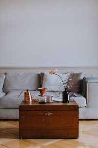
Emerging balance, simple tones. (Deborah Diem on Unsplash).
Effective Use of Negative Design
When things are cluttered and formless, we have trouble deriving a sense of attachment to place due to overstimulation. However, and perhaps paradoxically, searching for stimulation is exactly what the thoughtful use of negative space should be.
Try it out.
As an exercise, you could, for example, spend a week at work in which you consciously try to notice the ambient state of a cluttered desk. Live with it for a while. The following week, make a concerted effort to pare the desk down to its very essential objects for smooth functioning.
Sit with it for a week. Notice the objects.
There will be a short feeling of ‘less’, but likely of openness. Make a mental note of how your personal relationship to the objects is affected. The quality steel fixtures of a lamp, the emptied expanse of burnished desktop walnut, or the gentle curve of your potted palm, now visible after months buried behind folders.
The bet here is that you’ll encounter a general sense of relief. Possibly a heightened sense of curiosity regarding each object. If you instead sense fierce loss, then you have an opportunity to repopulate the aching chasm in your work life piece by piece until you reach an amenable saturation of stimulation.
You may just be functioning so much more productively without the prior distractions that you fail to notice how the negative (unfilled) space around you has focussed your attention on your work.
Negative Benefit
Considering interior design negatively will deliver positive results. The singular aim when looking to design a given space is to figure out what will bring that space into balance. Such an equality of the senses, a rightness, cannot be achieved by superimposing a design on a place, no matter how much you may wish to control the outcome.
Define and carry your intentions into a given space, for sure. Is it a space in which you want to find focus, sweet restful oblivion, or turbocharged excitement? The most pragmatic way to approach this is work from simple to complex, from negative to positive. It’s like salting a pot of soup. It happens little by little so the flavour iterates to where it needs to be, otherwise you add too much and ruin the lot.
This takes two skills, namely the purposeful restraint to leave a wall or surface blank, to embrace the negative and be still with it, and the ability to introduce objects step by step at a relaxed pace so you can acclimate to the changes you are making. The sense that a place is ‘well lived in’ comes from time, from the gradual settling of things that bring an implicit balance between negative space and positive objects into play.
Ultimately, there is no connotation of ‘negative’ or ‘positive’. A balanced interior space provides a welcoming interplay between the elements of ‘less’ and ‘more’. You will know when that balance is achieved, and it will undoubtedly shift in different directions as your relationship with the space matures.
Like any relationship, it takes a little work. But without that effort, you will never realise the full potential of your connection with space. Find it for yourself, or study it if you wish.
Less, ultimately, is still more.

Time to tidy the office when you can’t see the woods for the tress (Glen Noble on Unsplash).