Creating Ownership in Public Spaces
Public, vast, yours? (Photo by Maricar Limjoco on Unsplash)
Creating Ownership in Public Spaces
Whether you live in a peaceful village or a bustling metropolis, moving through and interacting with public spaces is part of everyday life. This is the common ground in which we can refresh our sense of community, remind ourselves that we inhabit a society, and perhaps even enhance our feeling of civic responsibility.
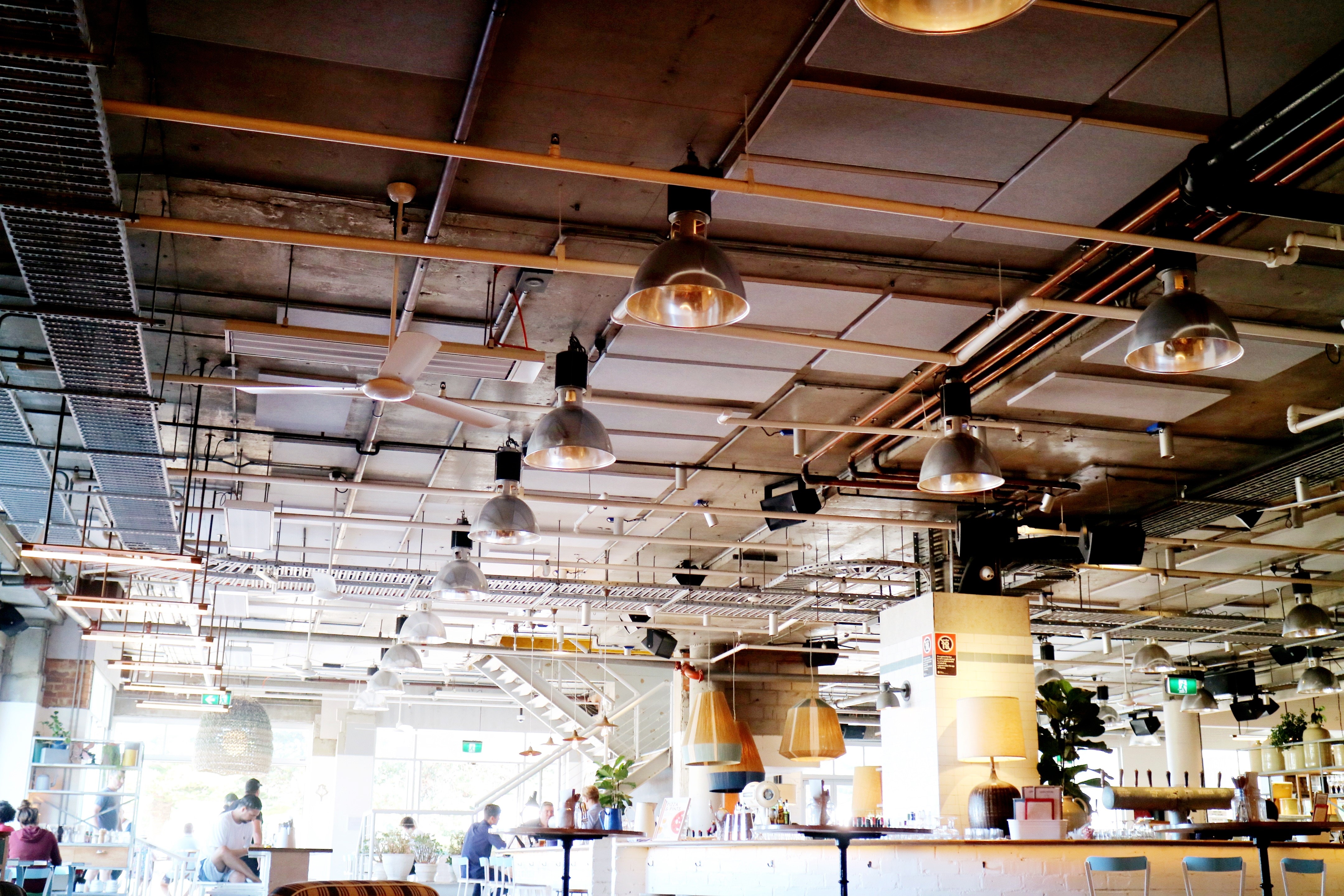
The term ‘public space’ typically conjures images of urban focal points. A busy marketplace, a graceful plaza, or escalators connecting hive-like floors of human movement. However, though many public spaces are indeed such areas of traffic, of our movement through to another destination, it is also the destinations themselves, the places we linger, that may be considered ‘public’. And by this, for example, we can consider our cafes, pubs and restaurants.
The places we may spend a great deal of time, yet are technically privately owned.
So, how do we create such spaces to make the users feel some sense of ‘ownership’, of comfort that they are not trespassing, but are open to using them not just for commercial transactions (buying a cappuccino), but as momentary inhabitants?
How do we bring these private/commercial spaces into the public domain?
Design…but less
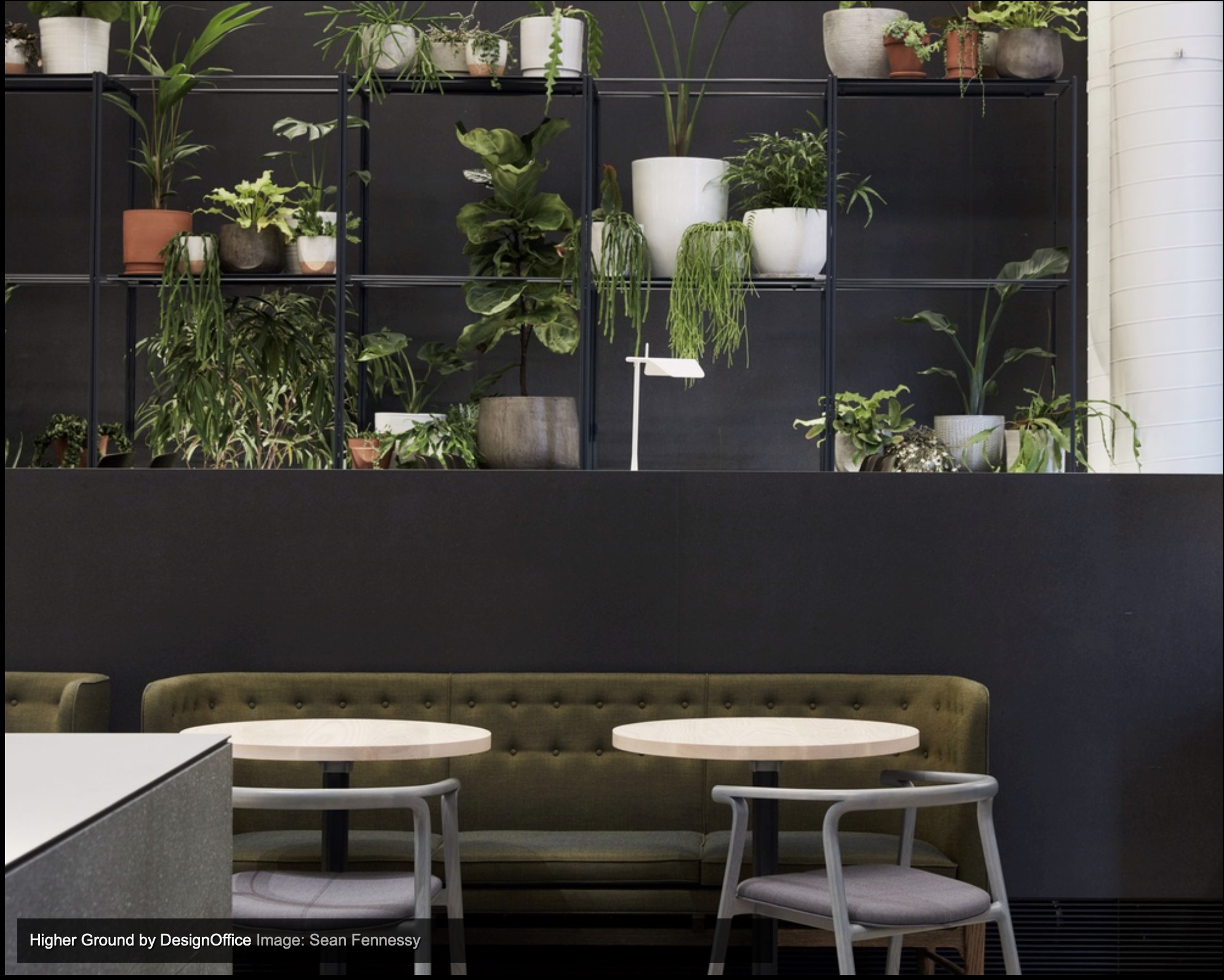
Natural/neutral colours broken up by interesting plantings (Image via Architectureau)
Certain core features will, if well considered, do a lot of the legwork in setting that atmosphere before you even fill the space:
Light – Where possible use the available natural light. It’s the simplest way to illuminate clean, simple space, and achieve vibrancy in colour. If not, use recessed spots to pool more light in certain areas for active use, leaving others more mellow for introspection.
Touch – Specify a minimal range of materials. Give preference to natural textures and shades. Wood is functional, warming, and connective. Use it to full advantage by providing smooth edges that invite touch and interaction.
Palette – Opt for neutral tones on surfaces and walls, harmonising the environment. Integrate depth of colour with wall plantings that layer calming greens into the surroundings and give lushness and texture to break up rectilinear architecture. Finally, choose art that invites emotional response through bold colour statements. Not too much, just a few pieces that draw the eye in and take you away somewhere else.
Clean & Simple
This isn’t simply a fad for the more minimal in the vein of your local Apple store. Rather, hedging your bets on less is always more is always going to be a pragmatic design choice. Experiments in strong branding are fraught with risk. The more defined the look and feel is, the more niche you are.
These spaces may be privately owned or rented, but they encapsulate public life. They, therefore, need to be designed to accommodate the variety of uses that people now demand, so, on the one hand, being convivial and social for celebration and noise, while on the other hand calming for those who wish to productively work, using the public anonymity around them as a method of focus. Modern technology has freed many people to work wherever they wish, but that doesn’t mean opening a laptop in a cafe is always going to be a successfully productive endeavour.
Design often starts with specific intentions, but these may be diverted by the ultimate use of the occupants. For example, a fountain in a cafe forecourt may be intended as a decorative feature, but might be used as a cool down playground by children in the summer. Does this infringe upon your business as the cafe owner? If children are happy, parents will sit nearby and buy your products. You created interest. Your business wins.
When people customise your space to their own needs, that is a sign of a successful design. It means that what you have created is approachable, something that lets people take ownership of it and foster a sense of their own belonging.
Ultimately, good design in this way equates to better business prospects because you created a sense of loyalty via an increased individual agency.
And that, just like their coffee, means having it their way.
The Rise of the Bean
Australia’s cafe culture has become synonymous with quality. Yes, the coffee itself made huge strides from what was available twenty years ago, but it’s the cafe design that also drives success. Take a look at the top cafes in Melbourne and the overt simplicity of all those designs is what stands out. It’s the unifying factor that allows people with differing needs to walk into the same (public) space and successfully do what they need to do.
Business meeting? No worries, long tables with ergonomic seating to cater for all attendees.
Freelancing office? Sit in a nook or on a couch, charge up your devices, and get it done.
Quick stop? Fine. Stand up and sip, Italian style, then go.
Catch up chat? Great. Enjoy the buzz of the scene and the espresso.
This means that the first step is actually backwards, away from the temptation to massively brand the space. If people are eating, drinking, talking, working, or recharging, then space needs simple core features that will do the work for you without overwhelming them.
Certain core features will, if well considered, do a lot of the legwork in setting that atmosphere before you even fill the space:
Light – Where possible use the available natural light. It’s the simplest way to illuminate clean, simple space, and achieve vibrancy in colour. If not, use recessed spots to pool more light in certain areas for active use, leaving others more mellow for introspection.
Touch – Specify a minimal range of materials. Give preference to natural textures and shades. Wood is functional, warming, and connective. Use it to full advantage by providing smooth edges that invite touch and interaction.
Palette – Opt for neutral tones on surfaces and walls, harmonising the environment. Integrate depth of colour with wall plantings that layer calming greens into the surroundings and give lushness and texture to break up rectilinear architecture. Finally, choose art that invites emotional response through bold colour statements. Not too much, just a few pieces that draw the eye in and take you away somewhere else.
Clean & Simple
This isn’t simply a fad for the more minimal in the vein of your local Apple store. Rather, hedging your bets on less is always more is always going to be a pragmatic design choice. Experiments in strong branding are fraught with risk. The more defined the look and feel is, the more niche you are cultivating. This is fine, for example, in a dining space with a specific culinary offering and the experience that accompanies it, but for public use spaces we need to create a holistic design that can accommodate all kinds of people, and that means less niche.
This is what successfully integrates diversity and spurs the creation of the ‘hub’, a place of cultural exchange, or even simply ‘the local’, as any solidly performing pub or cafe will come to be known. In this way, success in running a commercial business that sits squarely in the public domain almost means that any brand you start out with is ultimately diminished as your creation becomes known simply for being ‘the place to be’.
In a nutshell, unless you somehow have the next big brand and the marketing data to prove it, tone it down and create a design strategy that plays to the natural rhythms of humans.
How to Fill a Space
A simple approach to public space is to let the people fill it themselves because they like it, not by cluttering it by overly designing the space.
Of course, as a cafe owner you need sufficient table covers to make sales work, but packing everyone in like sardines is too niche a strategy. Give customers room to stretch their legs and you create a lounge. Do that and you instil a sense of comfort, one step along the path to giving a sense of freedom to that customer.
This is ‘design for inclusion’, and is a critical viewpoint to uphold if you’re looking to create a public space, well, for the public. In an age where brand loyalty is a key driver for resilient commercial success, the notion of getting customers in and out in the shortest time ergonomically possible does not encourage people to gather, slow down, interact and enjoy public spaces as they should.
Perhaps governments can blur the lines between outright public spaces and privately managed cafes and other venues so that we start to see all places as more accessible, open, and part of our right to linger. ‘Small islands of freedom’, as opposed to more ordered parts of the city. Simple, minimally branded commercial design is a starting point for us to feel we can claim spaces, albeit for a short time, as our own.